
Brand design
The Crannie is a new Community Spaces situated on Cranston street, in the New Town area of Edinburgh, Scotland. Run by local residents, the Crannie is a much needed resident support system which promised to give a voice and space to local residents in an ever commercialised part of our town. As one a part of the New Waverly developments, they needed a new visual identity worthy of the location they are so proud to care for and support.
Cranston street has a very rich history – during the eighteenth century it formed a key part of the route for the stagecoach which connected the people of Edinburgh to those in London.
In a similar fashion the Crannie will again today, connect individuals from various walks of life under one roof and for a single purpose – community.
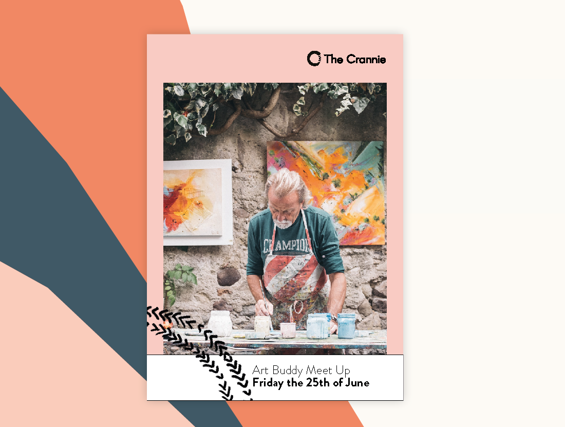
And this is the key concept leading the work – the suite of logos are based on an abstraction of a carriage wheel uniting 4 individual strokes (Work, Play, Meet, Events). Secondary patterns and illustration styles, are created using rough brushes and ink to resemble carriage marks on the ground.
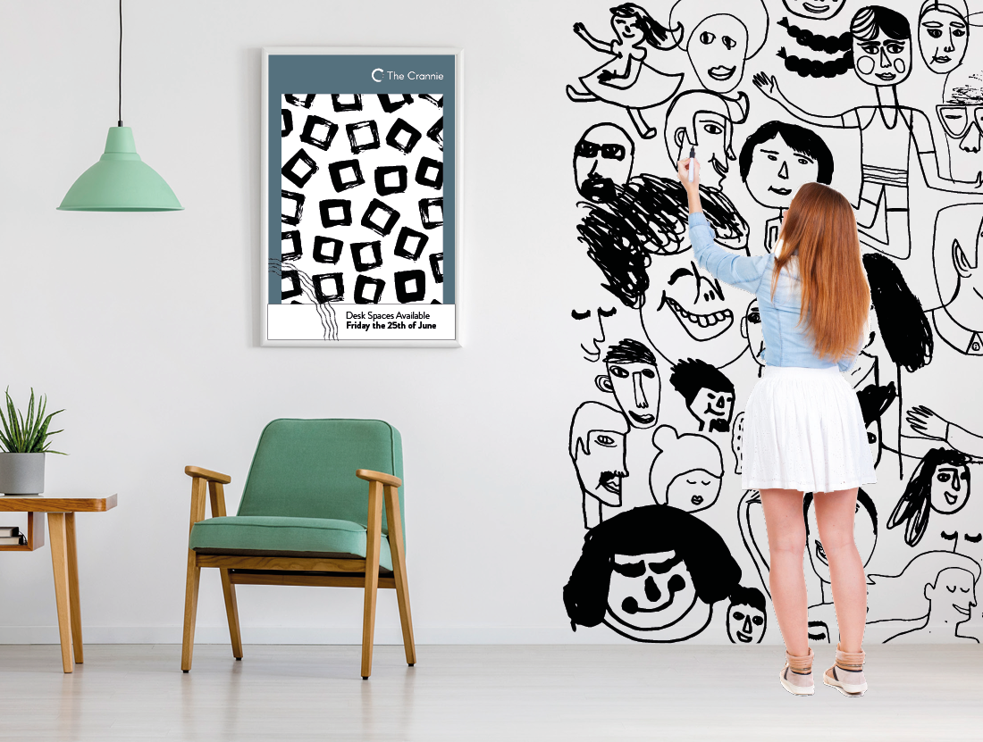
A whiteboard wall allows visitors to contribute by drawing in black marker – the art of which is then turned into illustrations to be used in the communications.